


I am a passionate digital marketer and EdTech enthusiast with 3 years of hands-on experience in the field. Apart from my expertise in the EdTech sector, my key skills include writing, market research and problem solving. I enjoy creating solution based informative content pieces that not only look good but deliver precise reader-intended information.
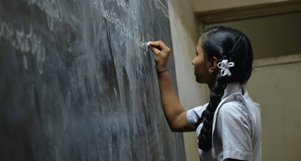
I have always had an interest in education and the EdTech industry because I believe digital tools can make learning easier and more fun. I love working on strategies that help educational platforms grow and reach more students. Helping people learn through digital channels gives me a sense of purpose.
In my free time, I like reading news, exploring new marketing trends, learning creative ideas for content, and sometimes even helping friends with their small business promotions. I’m always excited to work on new challenges and explore more opportunities in the education space through digital marketing.
Feel free to ping me on my work email, sonal@smaktech.com, to discuss my work at SmakTech or for any work-related queries!